by CLC Staff
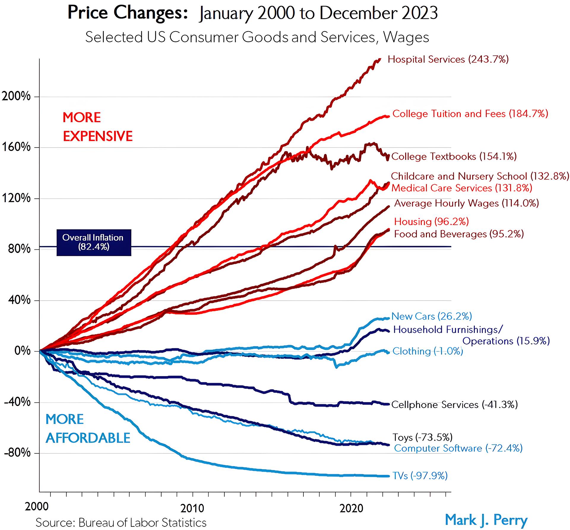
For nearly 20 years, Mark Perry, a scholar at The American Enterprise Institute (AEI) and professor emeritus of economics at the School of Management at University of Michigan-Flint — and conservative X’s favorite economist (he has nearly 30,000 followers, which is a lot for an economist) — has published a chart which illustrates the percent of change of the nominal prices of a variety of consumer goods and services since the year 2000.
Professor Perry regularly updates his “Chart of the Century” when the good folks at the Bureau of Labor Statistics releases its annual numbers on inflation (or the ) for the prior year.
Our loyal readers will recall that, in fact, the Bureau did just that a little over a week ago. The nation’s inflation rate increased by 3.4% over that of 2022 and the suits on Wall Street were not impressed. But that sounds like no big deal, right? After all, what’s not even four cents on a dollar?
The problem with inflation, though, is that it’s a compound factor — like your credit card’s interest, it compounds. With compound interest, interest is charged on interest from the previous month. So the longer it takes to clear your balance, the more you’ll pay in compound interest. For more information on inflation (and the whole compounding thing) Alan Brooke and Philip Sparks have an easy to understand post over on Financial Edge’s website.
Back to Professor Perry and his Chart of the Century. Here is what inflation looks like over the past 23 years for the price of various goods and services. The numbers are pretty self-explanatory:
“I’ve probably created and posted more than 3,000 graphics on CD (Carpe Diem, one of his blogs at AEI), Twitter, and Facebook including charts, graphs, tables, figures, maps, and Venn diagrams over the last 16 years,” writes Perry at his cleverly-named blog the The Unassuming Economist. “Of all of those graphics, I don’t think any has gotten more attention, links, re-Tweets, re-posts, and mentions than previous versions of the chart above, which was once referred to as “the Chart of the Century.”
“Marketwatch has featured the chart twice here and here and made this comment: When this chart’s creator, econ professor Mark Perry and the man behind the Carpe Diem blog, first posted it on Twitter, it was hailed as “stunning” and “one of the most important charts about the economy this century.”